Protiviti

Responisive design for global consulting firm website.

DESIGN


2016-2017

01

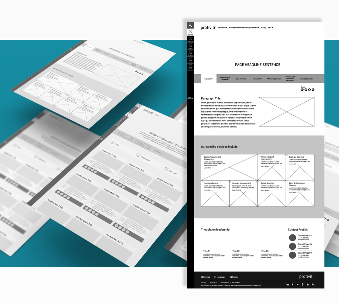
Wireframes

Wireframes

02

Branding

Hero Imagery

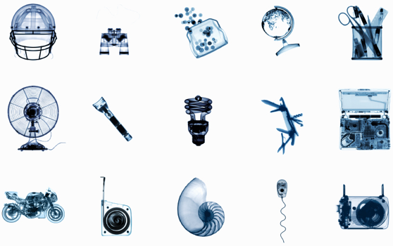
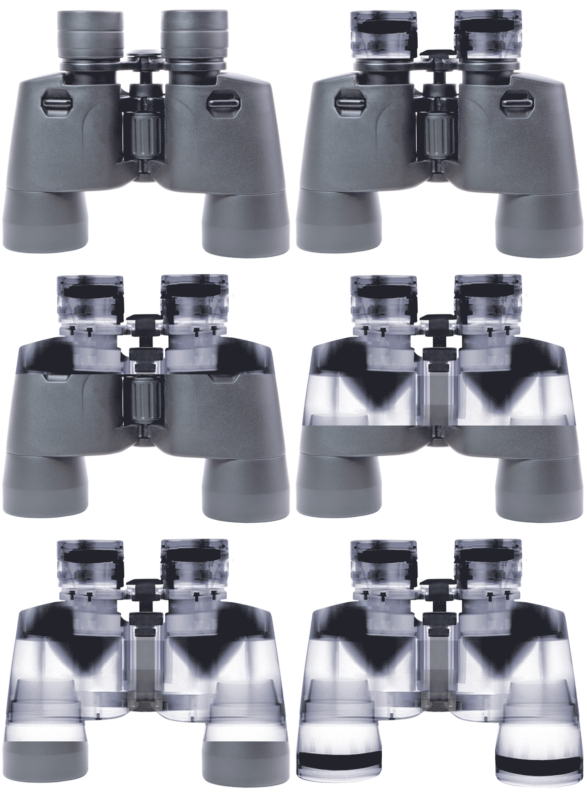
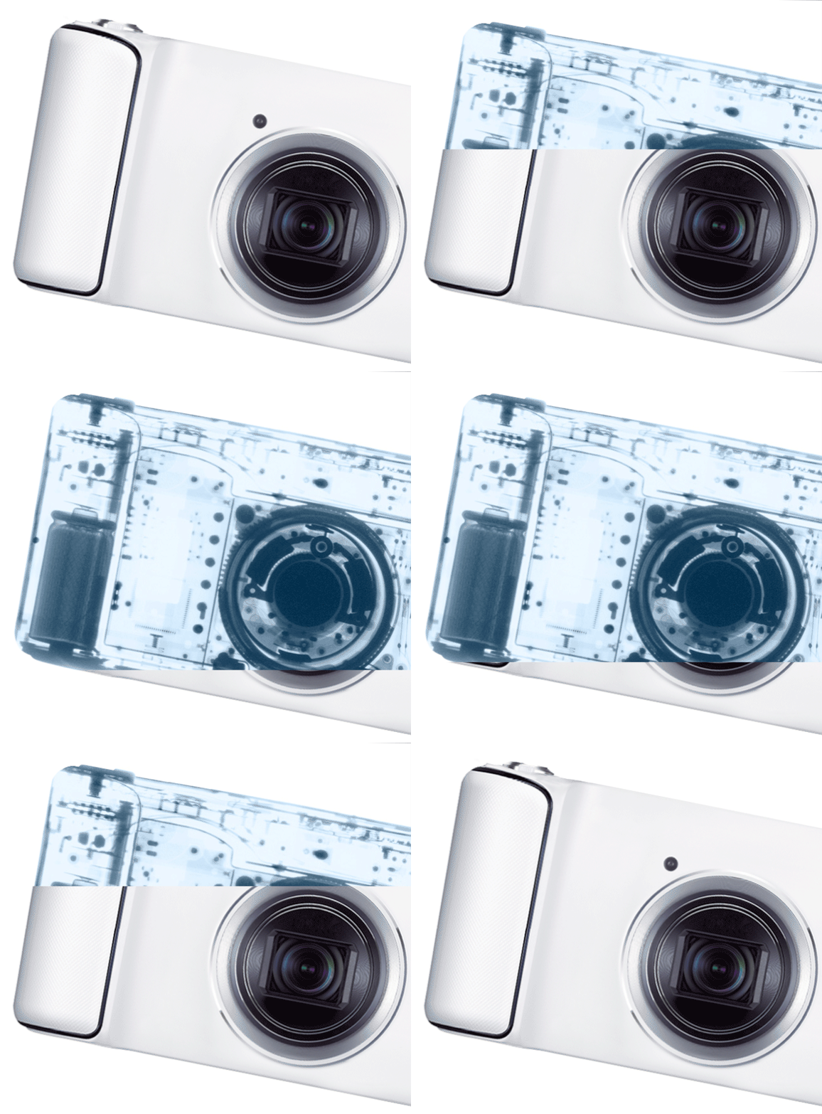
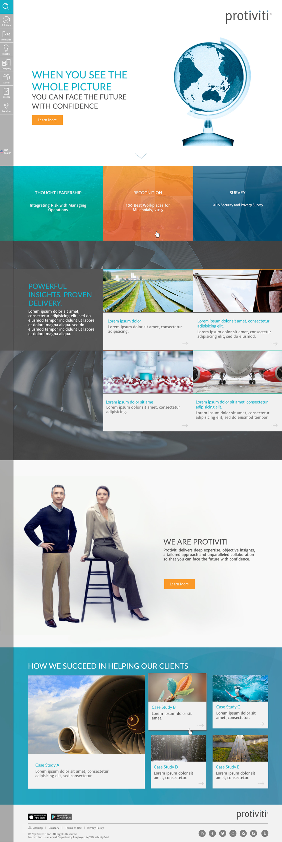
X-ray imagery is used as hero imagery to convey that Protiviti sees things more deeply (uncovers opportunities) to shape your business success.

Images are used primarily on brand focused materials such as key Thought Leadership pieces, advertising and other specific brand collateral. These images set the foundation for the concept with support of other photography and graphic elements.
examples of xray images
protiviti homepage
protiviti homepage
protiviti homepage

Colors

Colors
Colors

Gradients

Brainstorming sketch

Imagery

Imagery

Iconography

Icons

Paragraph Iconography

Paragraph Iconography
please click here to see the animation created to show the loading and hover effects on homepage
Paragraph Iconography

Navigation

Left Hand Side Menu

we meticulously crafted Protiviti's website navigation for optimal user experience. Opting for a left-hand side (LHS) menu with its eight tabs and intricate sub-categories, we aimed for predictability and simplicity. The LHS design not only declutters the interface but aligns seamlessly with users' left-to-right reading habits, enhancing readability. Navigating through Protiviti's extensive content is effortlessly intuitive – a click expands menus, maintaining visual hierarchy and keeping the interface clean.
Navigation
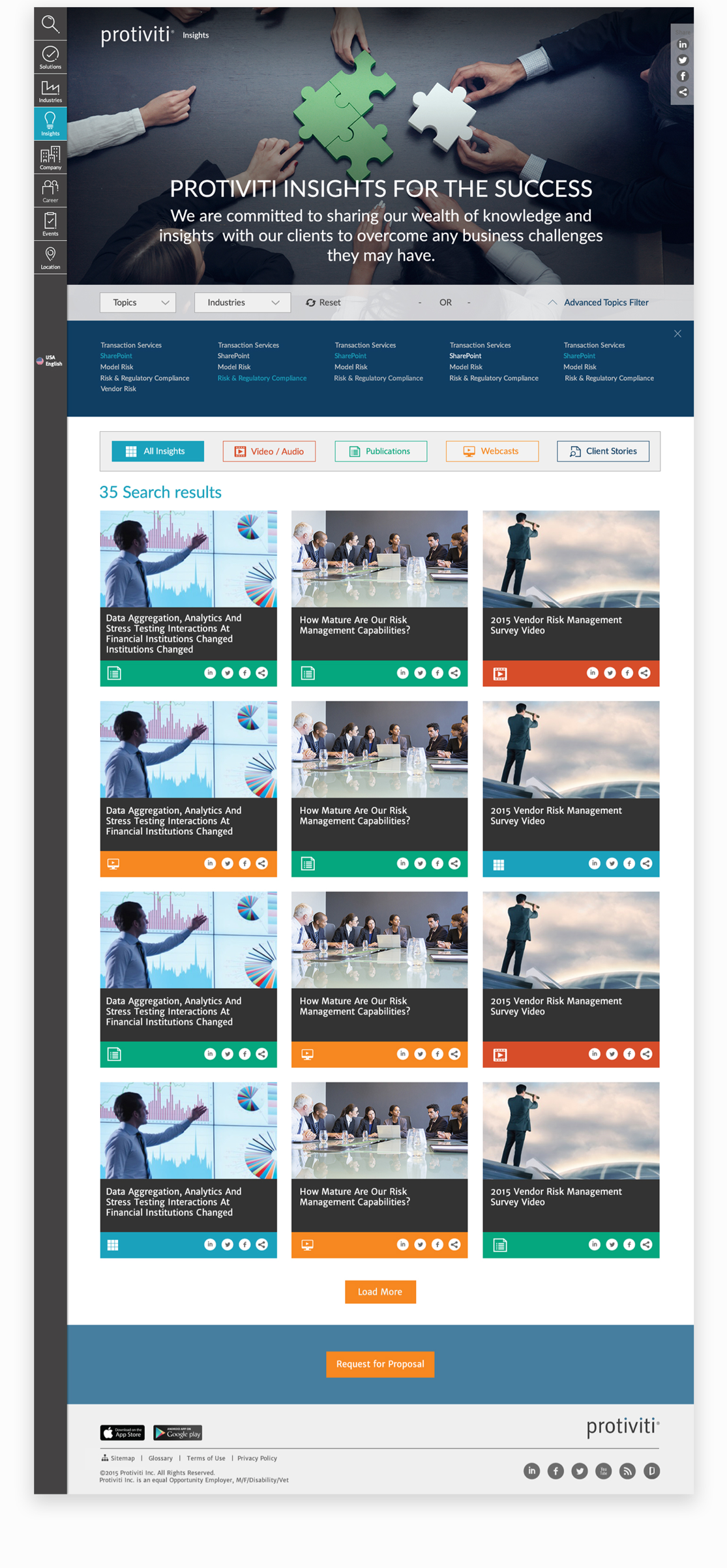
Insight page
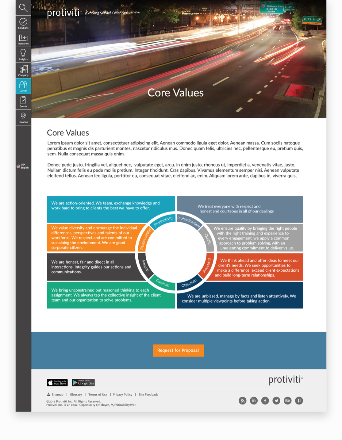
Core page
Events page
Company page
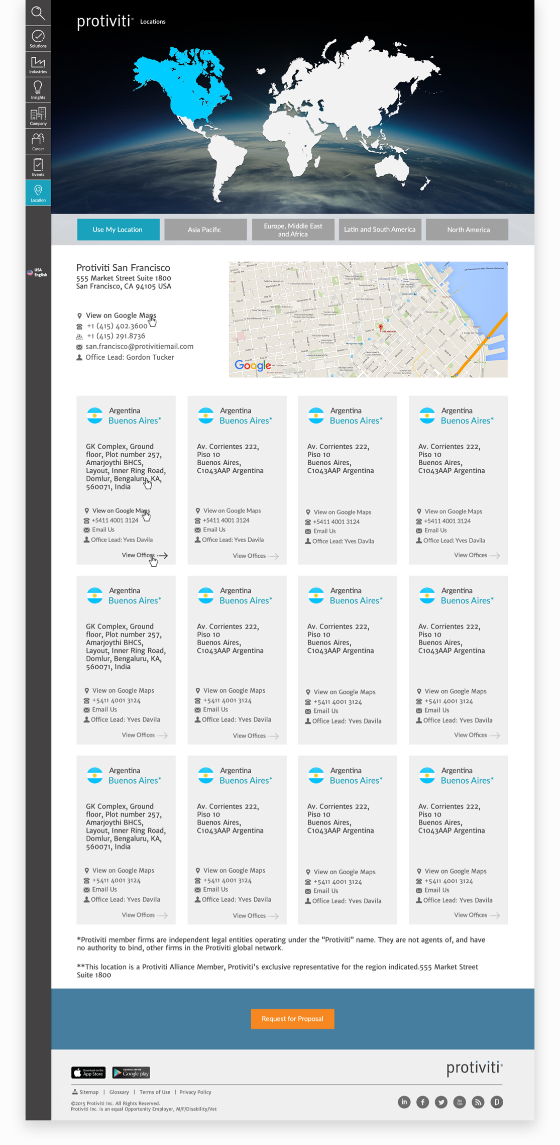
Location page